

A banner can be a flag or other piece of cloth bearing a symbol, logo, slogan or other message. A flag design is the same as the shield in a coat of arms is called a banner of arms. Also, a bar-shaped piece of non-cloth advertising material sporting a name, slogan, or other marketing message.

What you learn in this
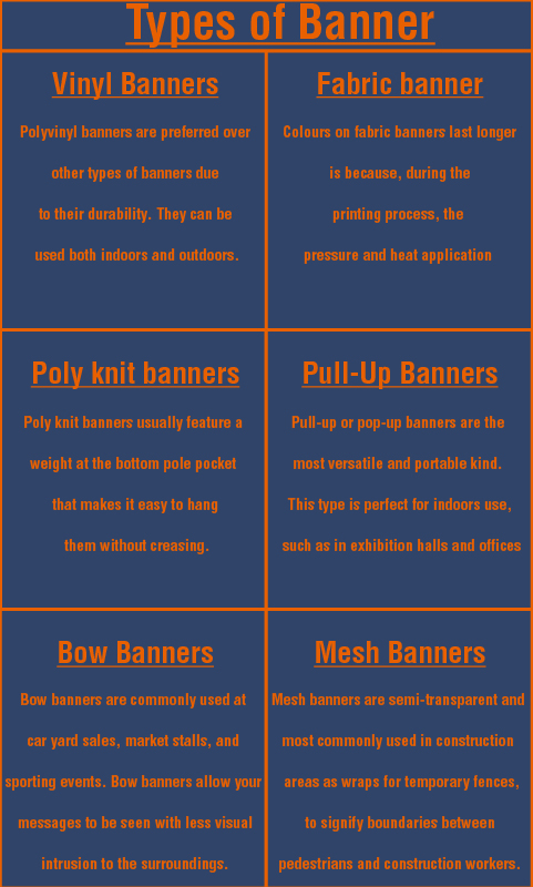
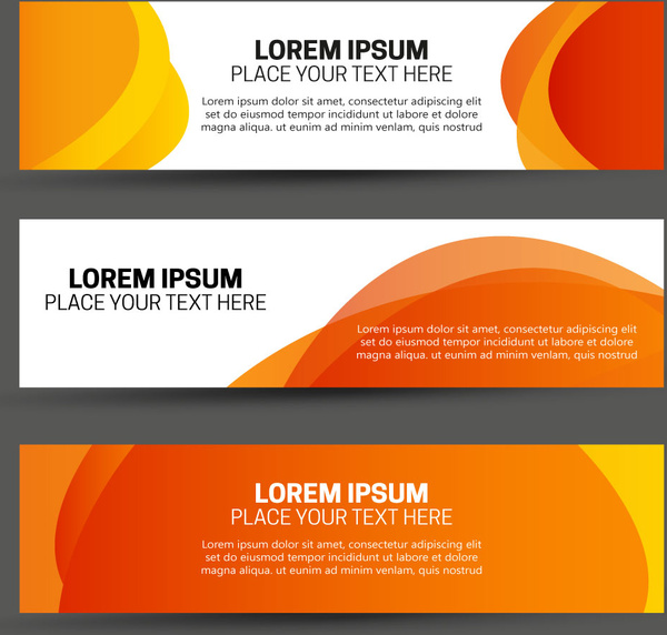
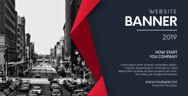
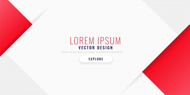
Types of Banner
There are basically 6 types of them which are given below: –
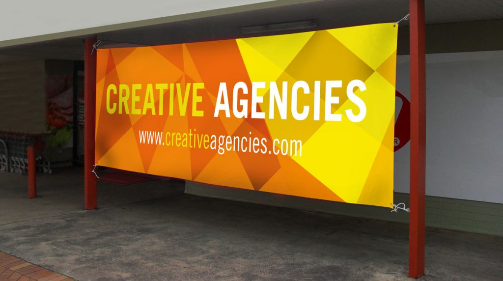
1.Vinyl
This types of banners is also know to be polyvinyl banners. These are currently among the most popular. Polyvinyl is prefer over other types of banners due to it’s durability. It can be use as both indoors and outdoors. In the 21 century, digital printing has become quite affordable.

It weighs around 13 oz., which represents the weight of material per square foot. The weight can range from 8 oz. to 22 oz. per square feet.
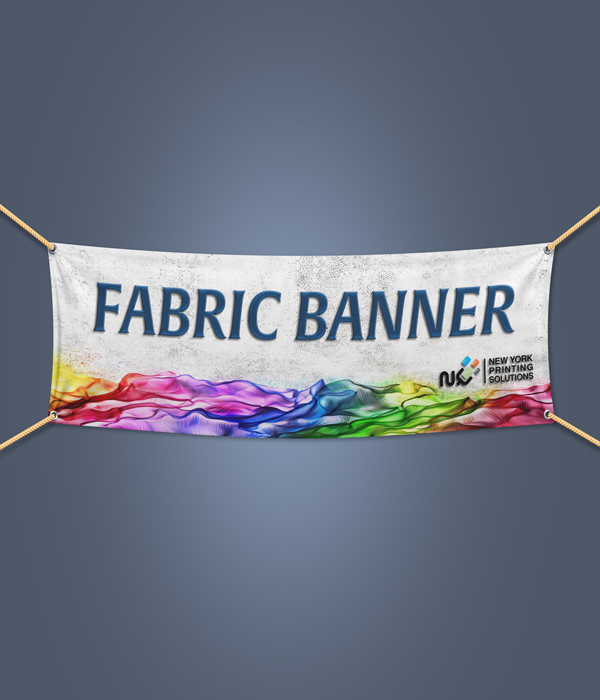
2. Fabric
It is a sub-category of poly . In fabric, in some cases known as polyester fabric banners. Their popularity has continued to increase due to their durability, which makes these types great for outdoor use. Besides, the printing technology applied to fabric banners produces incredible color durability.
Colors on fabric last longer is because, during the printing process, the pressure and heat application makes the fabrics cells expand and open up, resulting in better absorption of ink.
Printing process results in a continuous print tone, which is printed in full color is quite similar to an actual photograph. These banners are some of the most aesthetically appealing .

3. Poly knit
Poly knit banners is popular for the easy availability of polyester materials in the market. The most popular material under this category is the poly knit fabric, are having features a stretchy fabric that makes it ideal for use in trade shows and hanging displays.
Non-stretchy variant use to create it attractive that can be suspended from the ceiling. Poly knit usually feature a weight at the bottom pole pocket that makes it easy to hang them without creasing.

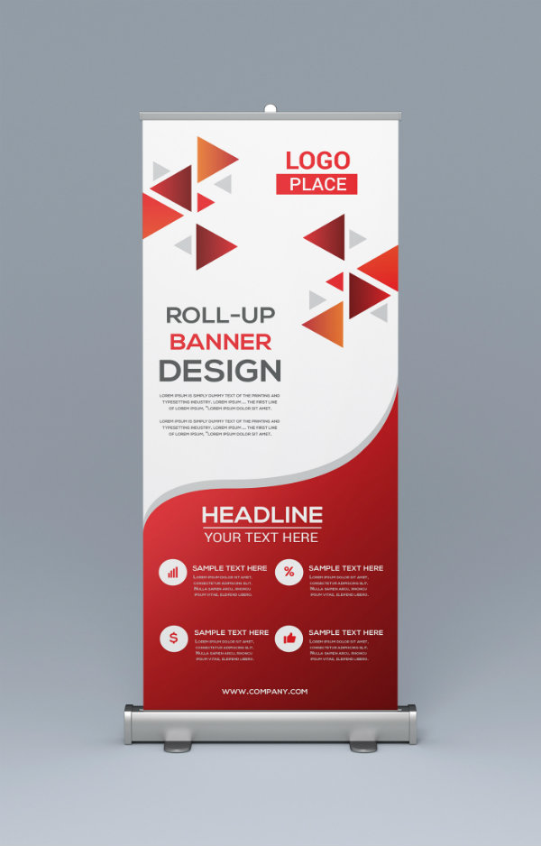
4. Pull-Up
Pull-up or pop-up banners are the most versatile and portable kind. This type is perfect for indoors use, such as in exhibition halls and offices. After you finish using it, you can fold it and put it back in its case to save space. You can use it for multiple events, but it’s also cheap enough for one-time use.

5. Bow
This type of banners commonly used at car yard sales, market stalls, and sporting events. It allows messages to be view with less visual intrusion to the surroundings.

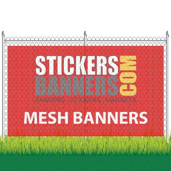
6. Mesh
This type of banners semi-transparent and most commonly used in construction / development areas as wraps for temporary fences, to signify boundaries between pedestrians and construction workers. Mesh banners is also great for areas with strong wind, as it come with small holes throughout that allow them to avoid a ‘sail effect’.

Details to be acquired
For a best design, you need some information to target the specific audience. There are few steps we need to decide before you start to design banner.
Placement
The first thing you should think about before making any other design-related decision is the intended placement of your banner. It might seem like you’re working backwards to some extent, the intended placement of your advertisement is likely to affect the choice of color scheme used for your design. Ideally, the color scheme it should be highly contrasting in comparison to its placement.

Large Text
You need to remember one thing about it is that in most cases, the aim is to attract attention from a distance. Because of this, you need to make sure that any content written on it is written in large readable text as without doing this, it’s unlikely that your banner will be readable to anyone more than a few meters away.

Choose Readable Font
It isn’t just the size of your text that matters; you also need to think about the font that you’re using along with the weight of that font. There are a lot of different fonts out there and it can be tempting to choose an overly flamboyant one but when it comes to banners, you always need to factor in readability. Mostly, bold sans-serif fonts will be more readable than serif fonts but this rule isn’t set as rock hard. For example, some serif fonts such as Times New Roman can be highly readable even as newspapers.
Provide A Simple Message
Another extremely important point to remember when designing is to keep the copy/message as simple as possible. Many successful banners are very simplistic in terms of the actual text content as most feature nothing more than a few words. The reason for this is simple; it need to communicate your message in as little time as possible as most of the target audience simply don’t have time to be reading paragraphs of text.

Use High Quality Graphics and Photos
Aim for most large vinyl banners is to attract attention (often from various distance), you need to do everything you can to draw the focus of passers-by to it. I’ve already mentioned color, typography and sizing – but another important aspect is to include high-quality graphic images. Images can act as a focus point for that and therefore, it will often entice passers-by to cast a glance in your direction. High quality graphic not only grab the attention but help you to convey the message.
Use of colors and space
Basics of color psychology can help you achieve great goals in advertising.
Personality of the brand is perceived by different factors — color combinations that dress your brand are playing an important role in how they support this personality that you want to portray.
Hope this will help you out to know how to use the colors in your ads so it can bring you closer to your goals.
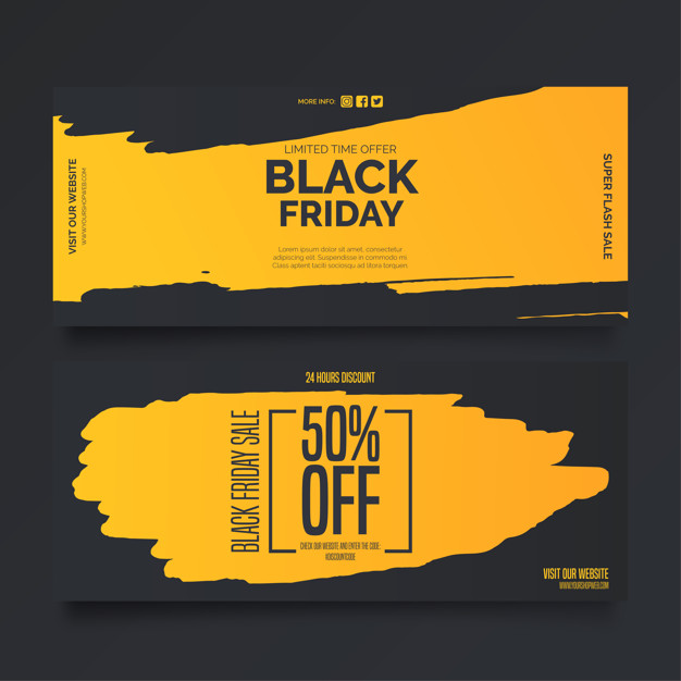
Yellow
It’s associated with optimism, energy, and sunshine, yellow is also a rich color reminding with gold and treasures.
Too much yellow can be risky.
Because it can be irritating to the audiences’ eye, and therefore is recommended to use it in moderated dosage.
Yellow alone is a very powerful color and you should balance it with either black or cool colors. Use yellow for industries like traveling, exploring the world and industry that aims to make the customers act fast in their buying decisions.

Orange
It stands out of the crowd and invites the audiences to be creative, friendly and enthusiastic, orange awakens the desire to be young again and to enjoy youth.
Dosage of orange is used as following: alone on a whole banner to grab the attention of the young minds and alongside with black, grey or white for balancing and highlighting purposes.
Orange is used for brands whose buyer persona is always young at the soul and want to be seen out of the crowd.

Red
Red is about passion, speed, love, and fire. It is activating, stimulating, passionate and powerful, and this is a color that awakens powerful sentiments.
It is used for a brand that inspires a sense of urgency and makes your heart pump more blood – in industries like food, retail and entertainment industry.

Black
Black isn’t a color, for it is the absence of color. As lot of brands use in their branding the black color combined or the simple plain black logo.
It is bold, powerful, confident and sophisticated combined with mystery, power, prestige, and formality.
Industry that offer a strong sense of manliness and power use black – car industry, technology, newspaper and journalism industries and sport companies.

White
Counterbalance white, which is actually a mix of all the colors from the spectrum, one needs to find a balance for it. White cannot stand alone and therefore it shall have another color for support.
White means simplicity and purity is aiming for the customers and audiences who already have their loyal customers in the house. But this does not interdict to choose a bright color in your branding and advertising strategy. Why so? Because white catches the eye immediately.
White is mostly used in the healthcare industry, medical drugs industry and brands that are powerful by their simplicity – IT and technology.

Now let’s make it
Get size
Decide where you intend to use your banner and choose the right size at the very start. Don’t worry, though! If you change your mind later, you can always switch to a different size.
Background and visual
Choose a color, texture or image that best fits the purpose. Add images and text that better convey your brand message and grab the attention of your audience.
Shape and buttons
Graphic elements will come in handy when creating your own design. Choose from a wide variety of custom buttons and add a clear call to action to it.
Animation and transitions
Now that you have your statics ready, take it to the next level and add animations or transitions. All your design elements can be animated.
Use
You can use it on for any purpose you want to use them.
FAQs
This whole is collected from internet and various source’s based on that compilation has been done to get a better perspective.
You can contact me @aditya.shekhawat22@gmail.com if you find something in appropriate in content or want to share some ideas.
Banner ads are intended to generate traffic to a website by linking to it. Also, web banners can function as regular, print advertisements: inform, notify about a new product, increase brand awareness and so on.
For banners with spot color vinyl graphics, a better rule of thumb is found in the “Sign Pricing Guide“. According to this valuable industry standard, the base price for a 24” wide banner should be 950 Rs per linear foot. So a 2′ x 6′ banner blank should be at least 5700 RS.
The Importance of Banners in Marketing. … There are a multitude of advantages to advertising your company or an event with a banner


